

CSS Grid Layout (aka “Grid” or “CSS Grid”), is a two-dimensional grid-based layout system that, compared to any web layout system of the past, completely changes the way we design user interfaces.
To get started you have to define a container element as a grid with display: grid set the column and row sizes with grid-template-columns and grid-template-rows, and then place its child elements into the grid with grid-column and grid-row. Similarly to flexbox, the source order of the grid items doesn’t matter. Your CSS can place them in any order, which makes it super easy to rearrange your grid with media queries. Imagine defining the layout of your entire page, and then completely rearranging it to accommodate a different screen width all with only a couple of lines of CSS. Grid is one of the most powerful CSS modules ever introduced.
Important CSS Grid terminology
Before diving into the concepts of Grid it’s important to understand the terminology. Since the terms involved here are all kinda conceptually similar, it’s easy to confuse them with one another if you don’t first memorize their meanings defined by the Grid specification. But don’t worry, there aren’t many of them.
Grid Container
The element on which the display: grid is applied. It’s the direct parent of all the grid items. In this example container is the grid container.
<div class="container">
  <div class="item item-1"> </div>
  <div class="item item-2"> </div>
  <div class="item item-3"> </div>
</div>
Grid Item
The children (i.e. direct descendants) of the grid container. Here the item elements are grid items, but the sub-item isn’t.
<div class="container">
  <div class="item"> </div>
  <div class="item">
    <p class="sub-item"> </p>
  </div>
  <div class="item"> </div>
</div>
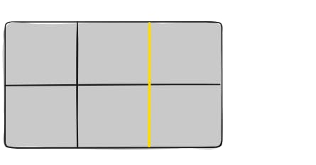
Grid Line
The dividing lines make up the structure of the grid. They can be either vertical (“column grid lines”) or horizontal (“row grid lines”) and reside on either side of a row or column. Here the yellow line is an example of a column grid line.
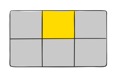
Grid Cell
The space between two adjacent row and two adjacent column grid lines. It’s a single “unit” of the grid. Here’s the grid cell between row grid lines 1 and 2, and column grid lines 2 and 3.
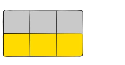
Grid Track
The space between two adjacent grid lines. You can think of them as the columns or rows of the grid. Here’s the grid track between the second and third-row grid lines.
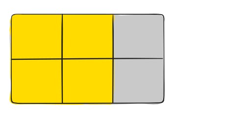
Grid Area
The total space surrounded by four grid lines. A grid area may be composed of any number of grid cells. Here’s the grid area between row grid lines 1 and 3, and column grid lines 1 and 3.