

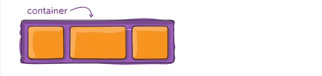
Since flexbox is a whole module and not a single property, it involves a lot of things including its whole set of properties. Some of them are meant to be set on the container (parent element, known as “flex container”) whereas the others are meant to be set on the children (said “flex items”).
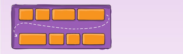
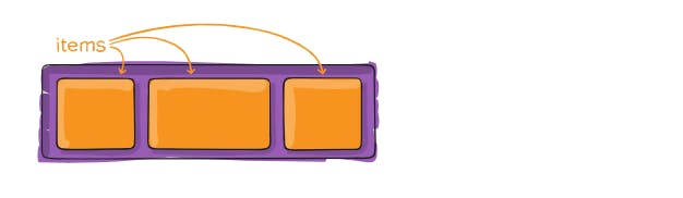
If the “regular” layout is based on both block and inline flow directions, the flex layout is based on “flex-flow directions”. Please have a look at this figure from the specification, explaining the main idea behind the flex layout.
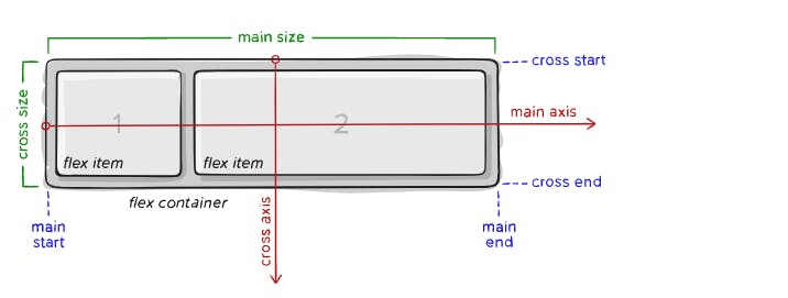
Items will be laid out following either the main axis (from main-start to main-end) or the cross axis (from cross-start to cross-end).
main axis – The main axis of a flex container is the primary axis along which flex items are laid out. Beware, it is not necessarily horizontal; it depends on the flex-direction property (see below).
main-start | main-end – The flex items are placed within the container starting from main-start and going to main-end.
main size – A flex item’s width or height, whichever is in the main dimension, is the item’s main size. The flex item’s main size property is either the ‘width’ or ‘height’ property, whichever is in the main dimension.
cross axis – The axis perpendicular to the main axis is called the cross axis. Its direction depends on the main axis direction.
cross-start | cross-end – Flex lines are filled with items and placed into the container starting on the cross-start side of the flex container and going toward the cross-end side.
cross size – The width or height of a flex item, whichever is in the cross dimension, is the item’s cross size. The cross size property is whichever of ‘width’ or ‘height’ that is in the cross dimension.
Properties for the Parent(flex container)
display
This defines a flex container; inline or block depending on the given value. It enables a flex context for all its direct children.
.container {
  display: flex; /* or inline-flex */
}
Note that CSS columns have no effect on a flex container.
flex-direction
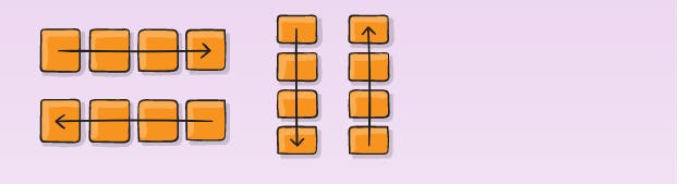
This establishes the main-axis, thus defining the direction flex items are placed in the flex container. Flexbox is (aside from optional wrapping) a single-direction layout concept. Think of flex items as primarily laying out either in horizontal rows or vertical columns.
.container {
  flex-direction: row | row-reverse | column | column-reverse;
}
- row (default): left to right in ltr; right to left in rtl - row-reverse: right to left in ltr; left to right in rtl
- column: same as row but top to bottom
- column-reverse: same as row-reverse but bottom to top
flex-wrap
By default, flex items will all try to fit onto one line. You can change that and allow the items to wrap as needed with this property.
.container {
  flex-wrap: nowrap | wrap | wrap-reverse;
}
- nowrap (default): all flex items will be on one line
- wrap: flex items will wrap onto multiple lines, from top to bottom.
- wrap-reverse: flex items will wrap onto multiple lines from bottom to top.
flex-flow
This is a shorthand for the flex-direction and flex-wrap properties, which together define the flex container’s main and cross axes. The default value is row nowrap.
.container {
  flex-flow: column wrap;
}
justify-content
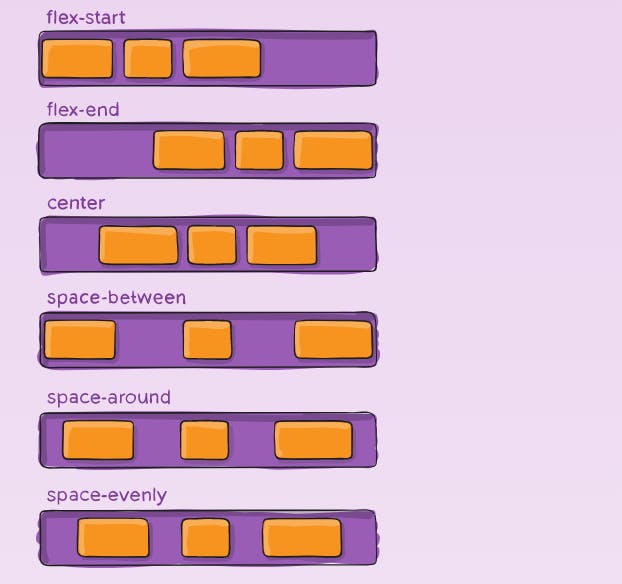
This defines the alignment along the main axis. It helps distribute extra free space leftover when either all the flex items on a line are inflexible, or are flexible but have reached their maximum size. It also exerts some control over the alignment of items when they overflow the line.
.container {
  justify-content: flex-start | flex-end | center | space-between | space-around | space-evenly | start | end | left | right ... + safe | unsafe;
}
- flex-start (default): items are packed toward the start of the flex-direction.
- flex-end: items are packed toward the end of the flex-direction.
- start: items are packed toward the start of the writing-mode direction.
- end: items are packed toward the end of the writing-mode direction.
- left: items are packed toward left edge of the container, unless that doesn’t make sense with the flex-direction, then it behaves like start.
- right: items are packed toward right edge of the container, unless that doesn’t make sense with the flex-direction, then it behaves like end.
- center: items are centered along the line
- space-between: items are evenly distributed in the line; first item is on the start line, last item on the end line
- space-around: items are evenly distributed in the line with equal space around them. Note that visually the spaces aren’t equal, since all the items have equal space on both sides. The first item will have one unit of space against the container edge, but two units of space between the next item because that next item has its own spacing that applies.
- space-evenly: items are distributed so that the spacing between any two items (and the space to the edges) is equal.
Note that that browser support for these values is nuanced. For example, space-between never got support from some versions of Edge, and start/end/left/right aren’t in Chrome yet. MDN has detailed charts. The safest values are flex-start, flex-end, and center.
There are also two additional keywords you can pair with these values: safe and unsafe. Using safe ensures that however you do this type of positioning, you can’t push an element such that it renders off-screen (e.g. off the top) in such a way the content can’t be scrolled too (called “data loss”).
align-items
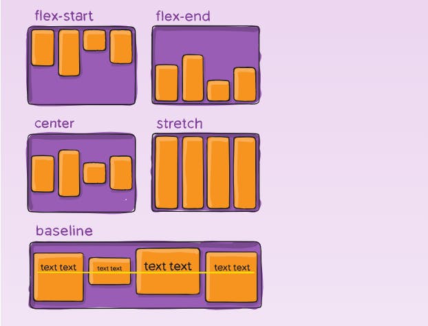
This defines the default behavior for how flex items are laid out along the cross axis on the current line. Think of it as the justify-content version for the cross-axis (perpendicular to the main-axis).
.container {
  align-items: stretch | flex-start | flex-end | center | baseline | first baseline | last baseline | start | end | self-start | self-end + ... safe | unsafe;
}
- stretch (default): stretch to fill the container (still respect min-width/max-width)
- flex-start / start / self-start: items are placed at the start of the cross axis. The difference between these is subtle, and is about respecting the flex-direction rules or the writing-mode rules.
- flex-end / end / self-end: items are placed at the end of the cross axis. The difference again is subtle and is about respecting flex-direction rules vs. writing-mode rules.
- center: items are centered in the cross-axis
- baseline: items are aligned such as their baselines align
The safe and unsafe modifier keywords can be used in conjunction with all the rest of these keywords (although note browser support), and deal with helping you prevent aligning elements such that the content becomes inaccessible.
align-content
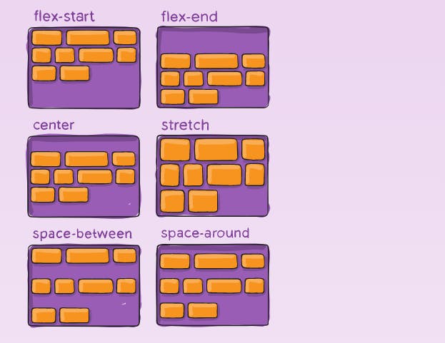
This aligns a flex container’s lines within when there is extra space in the cross-axis, similar to how justify-content aligns individual items within the main-axis.
Note: This property only takes effect on multi-line flexible containers, where flex-wrap is set to either wrap or wrap-reverse). A single-line flexible container (i.e. where flex-wrap is set to its default value, no-wrap) will not reflect align-content.
.container {
  align-content: flex-start | flex-end | center | space-between | space-around | space-evenly | stretch | start | end | baseline | first baseline | last baseline + ... safe | unsafe;
}
- normal (default): items are packed in their default position as if no value was set.
- flex-start / start: items packed to the start of the container. The (more supported) flex-start honors the flex-direction while start honors the writing-mode direction.
- flex-end / end: items packed to the end of the container. The (more support) flex-end honors the flex-direction while end honors the writing-mode direction.
- center: items centered in the container
- space-between: items evenly distributed; the first line is at the start of the container while the last one is at the end
- space-around: items evenly distributed with equal space around each line
- space-evenly: items are evenly distributed with equal space around them
- stretch: lines stretch to take up the remaining space
The safe and unsafe modifier keywords can be used in conjunction with all the rest of these keywords (although note browser support), and deal with helping you prevent aligning elements such that the content becomes inaccessible.
gap, row-gap, column-gap
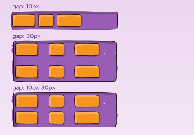
The gap property explicitly controls the space between flex items. It applies that spacing only between items not on the outer edges.
.container {
  display: flex;
  ...
  gap: 10px;
  gap: 10px 20px; /* row-gap column gap */
  row-gap: 10px;
  column-gap: 20px;
}
The behavior could be thought of as a minimum gutter, as if the gutter is bigger somehow (because of something like justify-content: space-between;) then the gap will only take effect if that space would end up smaller.
It is not exclusively for flexbox, gap works in grid and multi-column layout as well.
Properties for the Children (flex items)
order
By default, flex items are laid out in the source order. However, the order property controls the order in which they appear in the flex container.
.item {
  order: 5; /* default is 0 */
}
Items with the same order revert to the source order.
flex-grow
This defines the ability for a flex item to grow if necessary. It accepts a unitless value that serves as a proportion. It dictates what amount of the available space inside the flex container the item should take up.
If all items have flex-grow set to 1, the remaining space in the container will be distributed equally to all children. If one of the children has a value of 2, that child would take up twice as much of the space either one of the others (or it will try, at least).
.item {
  flex-grow: 4; /* default 0 */
}
Negative numbers are invalid.
flex-shrink
This defines the ability for a flex item to shrink if necessary.
.item {
  flex-shrink: 3; /* default 1 */
}
Negative numbers are invalid.
flex-basis
This defines the default size of an element before the remaining space is distributed. It can be a length (e.g. 20%, 5rem, etc.) or a keyword. The auto keyword means “look at my width or height property” (which was temporarily done by the main-size keyword until deprecated). The content keyword means “size it based on the item’s content” – this keyword isn’t well supported yet, so it’s hard to test and harder to know what its brethren max-content, min-content, and fit-content do.
.item {
  flex-basis:  | auto; /* default auto */
}
If set to 0, the extra space around content isn’t factored in. If set to auto, the extra space is distributed based on its flex-grow value. See this graphic.
flex
This is the shorthand for flex-grow, flex-shrink and flex-basis combined. The second and third parameters (flex-shrink and flex-basis) are optional. The default is 0 1 auto, but if you set it with a single number value, like flex: 5;, that changes the flex-basis to 0%, so it’s like setting flex-grow: 5; flex-shrink: 1; flex-basis: 0%;.
.item {
  flex: none | [ <'flex-grow'> <'flex-shrink'>? || <'flex-basis'> ]
}
It is recommended that you use this shorthand property rather than set the individual properties. The shorthand sets the other values intelligently.
align-self
This allows the default alignment (or the one specified by align-items) to be overridden for individual flex items.
Please see the align-items explanation to understand the available values.
.item {
  align-self: auto | flex-start | flex-end | center | baseline | stretch;
}
Note that float, clear, and vertical-align have no effect on a flex item.